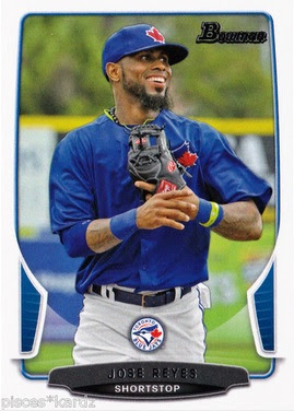
Maybe's it's not so much of a return in the "definition" of the word (whatever that means), but Bowman baseball in recent years has made an effort - likely (hopefully) unconsciously - of placing MLB team logos directly on the crotch of unsuspecting big league players.
Perhaps it's censorship, perhaps it's laziness or individuality (no one else seems to be logo-ing up crotches), but the heart of the matter needs some acknowledgement from us, the people who still notice these things, and that will be my intentions with this post.
I swear. Just acknowledgement. No jokes.
Let's start with my boy Jose Reyes.
Based on the look on Jose's face, he's either super-happy to be a Blue Jay and not photoshopped (finally), or a nice Blue Jays logo on the crotch tickles a little bit.
Tickle or not, sometimes you get the dangling Ol' English D:
Hopefully the Venezuelan flag in the background is a bit of a distraction from that BAM right in the groin Tiger logo on Avi here.
I'm kind of speechless on this one. I mean, I am sure the mail-order art degree clan that design Topps cards (Let's take the border and make it 1/10 of an inch wider at the bottom! Genius!) saw this one on the printing logo and thought that it was an instant gem. Yet, the ever-so-softly floating A's logo seemingly descending from, uh, Yoenis' Cespedes, seems kind of fitting to how I feel about the hobby right now.
Unless the logo is ascending...then it's kind of how Topps feels about their customer's these days.
The winner, however, is actually from the chromed-up Top 100 insert set. Behold:
Dylan Bundy's number one.
Eep.
I mean, come on. That has to be intentional.
But seriously, folks. These are just jokes. If you want to go ahead and get offended by the comments I've made on these cards, feel free to not visit this blog ever again.
Perhaps it's censorship, perhaps it's laziness or individuality (no one else seems to be logo-ing up crotches), but the heart of the matter needs some acknowledgement from us, the people who still notice these things, and that will be my intentions with this post.
I swear. Just acknowledgement. No jokes.
Let's start with my boy Jose Reyes.
Based on the look on Jose's face, he's either super-happy to be a Blue Jay and not photoshopped (finally), or a nice Blue Jays logo on the crotch tickles a little bit.
Tickle or not, sometimes you get the dangling Ol' English D:
I'm kind of speechless on this one. I mean, I am sure the mail-order art degree clan that design Topps cards (Let's take the border and make it 1/10 of an inch wider at the bottom! Genius!) saw this one on the printing logo and thought that it was an instant gem. Yet, the ever-so-softly floating A's logo seemingly descending from, uh, Yoenis' Cespedes, seems kind of fitting to how I feel about the hobby right now.
Unless the logo is ascending...then it's kind of how Topps feels about their customer's these days.
The winner, however, is actually from the chromed-up Top 100 insert set. Behold:
Dylan Bundy's number one.
Eep.
I mean, come on. That has to be intentional.
But seriously, folks. These are just jokes. If you want to go ahead and get offended by the comments I've made on these cards, feel free to not visit this blog ever again.


Bowman has had some awkward designs over the years, but I really don't understand what half-wit decided to do this. If it was an intentional, private joke thing, OK then, fine. ... no, that annoys me, too.
ReplyDeleteI don't blame you one bit. It would be fine if they hadn't cropped the photos so much, or selected different ones. The logo on the card, in the middle, is a novel idea - they just failed so miserably at it.
DeleteAnother reason to avoid Bowman all together. This "crotch logos" thing is just crazy.
ReplyDeletei hadn't even really noticed this on other cards from Bowman. kind of funny though...I sure hope it's an intended thing and an inside joke...pretty funny if it is. Otherwise it's poor design and a lack of awareness. I'm pulling for the former.
ReplyDeleteI don't know if you've seen the Yovani Gallardo from this set, but it's right up there with the Jose Reyes. The floating logos was one of the first things I noticed when I opened my first pack, yet I decided to collect it anyways. Eep.
ReplyDeleteThe Yo card was one of my first - but since I am out a scanner right now I didn't have a proper image to show it off.
DeleteBut yeah, I definitely noticed.
David Ortiz has an amazing card in this theme. He's got a pair of Red Sox hanging out of his pants. Of course it seems like that's the only card I ever pull out of these packs.
ReplyDelete