Normally, some bloggers would follow-up a post like mine yesterday with a "...well maybe yesterday I was a bit harsh..." introduction, but I won't be doing that. Aside from the base set and maybe 1-2 inserts per series, 2013 Topps is not special. Series 2 was a major step down in player selection, photography and inserts.


But, at least there are no pies in the face.
Which I hate.
My JV baseball coach, also one of the most influencial human beings on my life, once said something after we walked-off versus a division rival:
"Act like you've done this before."
You'd think after so long in baseball, the adult men would do this, but they haven't. And so it get shoved in our face in the form of pie-in-the-face, walk-off jump-on-the-plate and horrific celebration cards. No thanks.
At this point I'd like to mention that that little rant there was not planned. But on the bright side, the pie-in-the-face cards have been replace with something much more palatable:

Autographing! This is the only autograph SP I've really noticed in Series 2, mostly because I just don't care. However, all of your Jose Reyes shall belong to me, soon enough.
On a side, 331 was the final card of Series 1. And the first card of Series 2. More Topps trolling.
Also, Jose's facial hair on any other human being would be so douchey that I would have guerrilla attack it with a Bic lighter or angry doberman.
While I have my issues with Topps Flagship, I am still going after all of the parallels for certain players. They just look so damn good in pages. My first numbered parallel of Series 2 is a camouflaged Melky Cabrera:

Which leads me to the question - is this photoshopped? The piping on the pants looks a bit odd, and the scrolling across the chest is a bit too bright, and oh, HIS GLOVES ARE ORANGE.
I would think Melky would have had enough time to find some new batting gloves after his, umm, suspension in 2012. Plus, as the fable goes, he left all of his shit in the Giants locker room once he got slammed...so why would he even have them as a Jay?
One thing I secretly enjoy about this one, however, is this:

Neat.
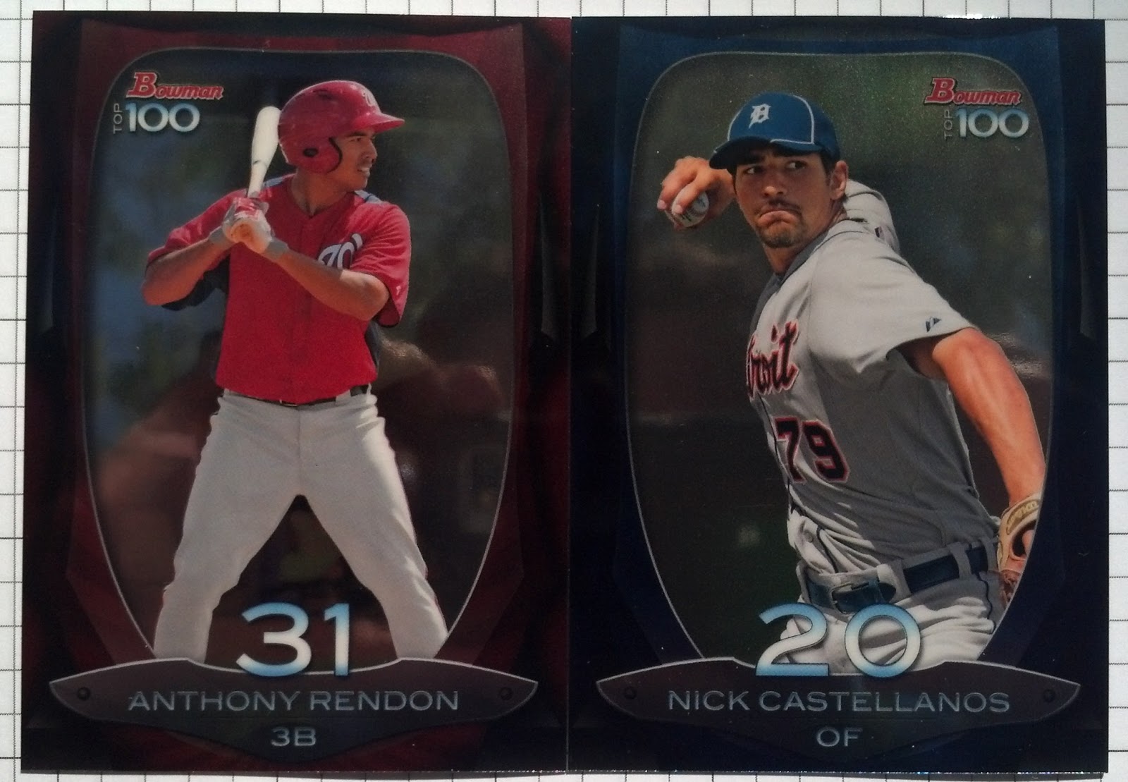
Enough Series 2.
Hey! More Joses!

Jose Reyes roooooookies! And a Francisco Lindor purplefractor! These both came to me on Monday night, but at the time, I was hosting an old freind. I enjoy them, but am seriously thinking of un-slabbing one of those clunky cases. Boo.
Of course, I saved the best for last.
That's a thing I often do.
And it's a good one:

Oh yes.
Rymer Liriano is out with Tommy John surgery (I sit back and watch the hits roll in) in 2013, which means his cards can be had quite cheaply. I don't know how many of these I have yet, or how many I need, but I know it's not going to get any easier. Oscar Tavares, Dylan Bundy, Matt Harvey still remain, and they will not come cheap.
Also, that Lake Elsinore Storm logo is PERFECT for this insert set.
Perfect.
At least it's something.