Pages

Showing posts with label COMC. Show all posts

05 January 2018

i checked out my cards: the oldest of friends


Right.

Back to it. This is the 3rd Edition of "i checked out my cards 2017" Black Friday binge, where I hit the core players in my collection: Roberto Alomar, Carlos Delgado, and Ivan Rodriguez. Previous entries here and here. It's an Alomar-heavy crop, so if you don't like Hall of Fame second baseman, just leave. No one will miss you.

On to the cards.


The original Bowman's Best (1994) was basically a cacophonous version of Topps Finest, which was a huge hit in 1993 and the original high-end set. I don't remember their releases, but I can imagine they were hyped up back then. Bowman's Best had kind of a granite countertop thing going on beneath the chrome, which as a (very) young geologist, I appreciated.


The original Topps Finest was solid, but the design certainly hasn't aged well. There were parallels back then, of course, like this blue one (1 of 5,000!) featuring Alomar in the white-paneled Jays cap. Superb.


Topps of 1993 is an important set to me, not so much because I like it now, but because its the first cards I remember opening. The Blue Jays had just one their first World Series in 1992, and Alomar was a star. Black Gold cards were the first insert I remember aside from regular old Topps Gold, but they were the first with the hologram-style foil. Nearly 25 years later, I still love the Black Golds.

This time through my COMC Black Friday binge, there was something I was searching for in my Alomar collection.

Headbands.

Topps is still producing Alomar headband cards, such as the Archives offering from 2016. Not my favorite Alomar, but I'll take any one of him in the headband.

Like this 1993 Fleer:


Or this much higher-end 1995 SP:


And my current favorite, this 1994 Collector's Choice Up Close & Personal.


I'm pretty sure I pulled this card as a kid, but I was about eight years old and those corners are going to straighten themselves. I've replaces a few gems from my childhood.

This isn't one of them:


Ewww, Orioles. Bowman's Best was much more cleaned up and impressive in 1995, and while it's hard to tell from the photo, the quad-player offering is actually a refractor. Desi Relaford didn't make much of himself, but on the back is Craig Biggio - another Hall of Fame second baseman and Luis Castillo, who did have a nice career.

Okay, one more Alomar for the road.


I would have to put Diamondbacks Alomar as my No. 2 to Blue Jays Alomar, as his cards with them are pretty rare and given his long career, seems almost ridiculous. I've had my eye on this one for a few years. I must have been the only one who wanted it. That's fine.

On to Carlos Delgado! You might want to put your sunglasses on now because it's about to get really shiny around here.


I've always wanted an International Refractor, and a 1998 Bowman Chrome of one of my favorite Jays is a great place to start. Delgado is easy to collect in that way: his cards are affordable, he never played in an era of low print runs, and there's not a whole lot of competition for him. It leads me to pick up cards I wouldn't normally jump on, ones I just admired in black and white from the pages of Beckett, like this 2000 PACIFIC Prism (with an "S", that's how you know its good) Drops Silver parallel.


And man, is it heckin' cool in-hand. Prism from 2000 was a pretty set regardless, but this background pattern is especially fun. Shall we taste the rainbow?


Upper Deck (UD if you were a cool kid) Ionix was a fun one-and-done brand in 2000. The bend of this card gave it a good scan, but in-hand kind of looks like how a card would look if you somehow turned SURGE into cardboard and printed baseball players on it. Which fits into the style at the time


LOUD. Delgado spent just one season with the Marlins, but it was a very good season in which he hit 33 HR and drove in 115. As a 1B, the analytics didn't love him, and he only put up an fWAR of 3.3.

Also that year, the Detroit Tigers were very bad, but they had a very good All-Star catcher that season in Ivan Rodriguez. There's no Tigers cards to show here, just Ranger - but they are magnificent. We'll start with this absolutely perfect 1994 Topps Stadium Club where he's deck out in the Tools of Ignorance:


It doesn't get much better than that. TSC 1994 is a set I will have to complete someday. It's not as artful as some other TSC offerings, but the photography remained outstanding and the plastic-personalization name labels was so fitting for 1995.


In 2001, Pudge won his 10th Gold Glove. Upper Deck was getting more interesting with the memorabilia cards by that time, and the price was right for me, 16 years later, to grab this game-used batting glove card. 

Okay. You've made it this far, and you deserve something great. I give you: 1994 Upper Deck Ivan Rodriguez - Electric Diamond parallel!


Pretty cool, right? Pudge was so popular by 1994 that he warranted one of the best-looking cards in the set. However...

It.

Gets.

Better.

Are you ready? Good.


...


BAM.


We're not worthy. 

30 December 2017

i checked out my cards: keep doin' that hockey


Welcome back to the second in a line of what will likely be around 10 posts representing my 2017 COMC Black Friday binge. Today, we keep doin' that hockey, with some new additions to my Minnesota Wild and Toronto Maple Leafs collections. There's also an Islander/Sabre snuck in.

Speaking of the Sabres, the first card there up at the top is of Marco Scandella, who Minnesota lost to the Sabres in the Tyler Ennis trade. It was a good deal for both sides, but personally I preferred Scandella.


This looks awful, but it isn't. 2016-2017 MVP had this awful foily throwback SUBSET reminiscent of Skybox's Skylines in 2000. I love that MVP offers subsets and this one is a beaut, Clark. 


The best thing about collecting hockey cards is that I still get Upper Deck in all of it's wonderfulness. Above is just the base card for Nino Niederreiter (my first Nino!) from 2015-2016. And its a great base card.


Moving into the veterans and parallels, this red parallel from 2016-2017 O-Pee-Chee Platinum (/199) is one of my nicer Mikkos at this point. My collection is certainly lacking.


I always wanted a Cramer's Choice card, and a couple months back I acquired a Rick Ankiel from 2000 Pacific Invincible. Knowing that Crown Royale brought them back to the hockey world recently, I looked for the cheapest one I could find of a decent and active player. Matt Moulson, now banished to the AHL, was that player. This one is a nicely thick die-cut with red and silver foil treatment and a snow white band for the ink. In-hand, this is a gem numbered to just /199.


With O-Pee-Chee (cough Upper Deck couch) free to do as they wish in hockey, there's plenty of die-cuts still, and they don't suck. From 2015-2016 O-Pee-Chee is this James van Riemsdyk, who I've really come to like this season (not like I didn't before) just in time for him to become an unrestricted free agent at the end of the season. 


And here he is again from 2016-2017 Upper Deck, this time on the Canvas variations. This is one of the more benign photos used for Canvas.


Hey, that's better. And it's Nazem! Kadri was one of my collections I tried to really boost this Black Friday, and I added on goodies.


Like Mikko Koivu, I grabbed his red prim from 2016-2017 O-Pee-Chee Platinum.


As well as his Colors & Contours from 2015-2016 and 2016-2017 Upper Deck MVP. The top is a Level 1 Purple (sure, why not) and the following is a Gold - Level 2. So it looks like I have some rainbows to work on.


Kadri fell to Series 2 in 2014-2015 Upper Deck, but he did so with this beauty, in one of the most Nazem Kadri cards I've seen. Hockey is dominated by action shots, and Upper Deck plays around with their photos all the time, resulting in gems like this.


They also play the high-end game as well, creating bafflingly low-glass small-time hits in expensive box breaks such as this one. The green jersey parallel from 2015-2016 Trilogy (of what, exactly) is a pretty nice one in-hand, but the cheap digital numbering adds a handle of Barton's Vodka to the mix for such a classy set.

So that's our hockey. Still to come from the COMC binge will be:


  • Hall of Famers and Legends
  • Baby Jays
  • Champion Jays
  • New Collections
  • Dirt
  • Hits
  • Doc, and:
  • What the hell was I thinking Buying this Card

28 December 2017

i checked out my cards: fringe/average

I made it a point in 2017 to once again go hard at the Black Friday and Cyber Monday deals over at COMC.com. I hadn't made a late November order & shipment there since 2014, so I had already built up a decent inventory, but I tossed a few more bills with America's Worst President on them into my budget and took a shot at establishing some new collections.

Here are some guys I like to call my fringe/average collection, guys I like to collect but don't always seek out. You may get some comments on your blog from me about them, though.

Josh Donaldson


Let this be a lesson to you COMC shoppers: manage your damn inventory. I wound up with three of these very thick but also beautiful Josh Donaldson cards in this order, but that's okay. There's other Blue Jays collectors out there that might benefit from adding these. Let me know if you need one.


You might be wondering why I don't target Josh Donaldson, the best position player on the Toronto Blue Jays since 2011 Jose Bautista. Well, Dosh is a free agent after 2017, and he's never tested the open market. He's mentioned he's open to staying in Toronto long-term, but management doesn't like to pay anyone besides old, fat, slow first baseman. So I'm thinking his 2019 cards will feature him in at least two different uniforms that might not be Blue Jays ones.


But man, he makes the high-end cards of late look great. Inception, Museum Collection, and here on an Atomic Refractor from 2016 Bowman's Best.


Yu Darvish

I was heartbroken when the Texas Rangers won the bid for Yu Darvish a few years back. Less so when they worked the guy over in the 2016 playoffs. But still, he's one of my favorite pitchers and I'll often tune in to watch him pitch on the west coast after Blue Jays games.


Here's another 2017 Bowman Inception, which is one of the best looking art sets ever made.


If you haven't figured it out, yet: I like refractors a lot. That includes these 1989 reboots as well as the Bowman's Best Bluey (/250) above.


And this one, from 2014 Topps Finest. Of all the zombie Topps sets, I love Finest the most and I won't be apologetic about it. Especially with reboot gems like these:


I had a lot of problems with these when they were first re-released, mostly due to the ridiculously prominent TOPPS FINEST STERLING logo taking up half the card. You know what...I still do.

However...

Intimidators was one of the better iterations of Finest. The purple here makes the card just explode in-hand, and it scanned pretty well, too.

So, that's only two guys. It's a bit difficult to break up an order of about 200 cards, so many had to be cut, but these ones stuck out and deserved their own post. Here's what's still to come:


  • The Oldest of Friends
  • Baby Jays
  • dirt
  • The Mojo
  • Keep Doin' that Hockey
  • Hall of Famers
  • Doc

29 March 2013

New JPAs from COMC (White Whale)

COMC is hosting another wonderful sale. This one, involves free shipping and sales from what seems like most of the sellers on the site. As this is often the best time to buy on COMC, I jumped on some John-Paul Arencibias that had my attention.

First, some gold:
There be gold in 'dem packs.
Gold Rush cards were available via wrapper redemption from some Topps product last year...probably series 1 or 2. I don't know for sure, as I wasn't really back into it until late summer. I won an auction on ebay for the autograph version of this, which although stickered, is still a swell card. These actually give a little bit of a gold look and feel. I like them, but I don't plan on getting any more that don't have Brett Lawrie on them.

Some Black:
Once you go black, you realize you don't have this one in green.
 The black parallels from last year's Gypsy Queen were a step back from 2011, and 2013 also seem to look a bit better. I cannot complain, though, as JP is absent from both '11 and '13 (and will be from mostly all 2013 releases.) So I'll take what I can get.

Gold, black...how about some Blue?:
Left: Awful Spring Training pose
Center: JP disgusted in Dome attendance.
Right: Air JP
What you see above is 2010 Bowman/2011 Bowman/2012 Topps. Blue parallels in Bowman are so much better than those from SprawlMart in Topps releases, but you cannot beat that photograph of JP, placing a tag on a lowly Oriole. The photo on the '10 Bowman RC is probably my second least favorite JP card, while the 2011 Bowman is one of my favorites od all time. I mean that thing is awesome

The Blue Bowman parallels are very underappreciated on the secondary market. I don't think a single one of these cost me more than $.80.

Keeping the theme of 2011 Bowman paralles, I present you this:
Boy, do you think next year you could commit a crime in Orlando, Florida?
Ahh, International parallels. You are my favorite. Too bad America's wang is shown in the background. 2011 was a terrible year for International parallels.

If you came here looking for the White Whale that I mentioned in the title, wait no longer. This card was produced in 2007 (possibly 2008), many years ago, before JP even had a fitting for a Blue Jays jersey:
White Whale Landed.
Oh yes. I like. Amazingly, this card has foil board on the front and back. I just find that awesome. It is also numbered 002/500.

Hope you enjoyed the new adds. More to come.

15 January 2013

COMC #2: Prospectin' Francisco Lindor

I like to think that on this here blog, I don't keep secrets. If I find a market inefficiency, I will share it. My COMC deals and methods? Shared. Prospecting? Shared. Mostly. Some of my prospecting should pan out quickly.

See: Marcus Stroman, Taijuan Walker.

Some other will take time.

See: Strkyer Trahan, AJ Jimenez and the starring role in the post you're reading: Francisco Lindor.

Much of my prospecting comes from the bang-on analysis of prospects I originally heard in the now defunct Up and In podcast from Baseball Prospectus featuring Jason Parks and Kevin Goldstein. Goldstein is now a higher-up in the Houston Astros (long overdue congratulations), and Professor Parks will be returning this spring with a new podcast. This inspires elation in me.

The guys on the podcast were big on Francisco Lindor. Until recently I didn't know much about him. What caught my eye to him was his gorgeous signature featured on baseball cards. It's always something simple like that, isn't it?

Unfortunately, this post does not feature a signature of Frankie Lindor. However, it does show off some goodies I picked up of him earlier this month from COMC.

Let's move through time:

2011 Bowman Draft Picks & Prospects & guys you've never heard of that will be selling oranges on the Freeway by January.
Two-thousand and eleven featured Francisco Lindor in a Cleveland Indians get-up for the first time, as you may have noticed from the iconic 1st Bowman Card stamp in the upper left. The first/RC logo/XRC clutter plaguing out collecting universe needs to end. Rookie Card logo, All-Star Rookie logo, nothing else.

For some reason, 2011 Bowman had prospects shrouded in black borders. As a fan of cards in black, this is actually not one of my favourites. So it goes.

2011 Bowman Draft Picks & Prospects but chrome this time instead of paper.
Hey, look! It's Lindor's 1st Bowman CHROME card! That's different, somehow! 

Possibly. I guess chromes, though usually around 2-3:1 packs, are a parallel to the Bowman paper cards. I'd rather have a paper rookie card. You cannot beat that authenticity. 

So I'll admit, at this point, that Lindor cards are kinda repetitive at this point. It won't get much better, save for a new photo and borders on the following:

Internationale.
One of the selling points on Lindor is his ability to switch-hit, while being rangey middle infielder who hits line drives and is apparently a hard worker. Sign me up.

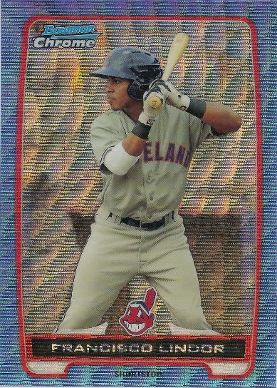
The Bowman International parallels, exhumed for 2012 are my favourites of the year. Even more, brace yourself, than purple refractors. Happily, I was able to obtain this one of Lindor, featuring a Puerto Rican flag. Lindor was born in Puerto Rico but moved to Florida for boarding school at the ago of 13. I think his folks knew they had something in their young middle infielder at an early age.

Wavy.
Ohhhkayyy so maybe these beat the International parallels in a taste test. Blue Wave Refractors are simply fantastic. If you're having trouble picturing the light-exploiting effects of this card, go through a search on ebay or imagine an XFractor Laser Show if it happened in 1994. Sure, they're loud and gaudy and colourful, but is that really that much of a bad thing?

I don't think so.

14 January 2013

COMC #1 - JPA and the Miscellaneous


I managed to raid the COMC silos filled with cardboard goodies again recently.

I enjoy COMC orders every time. While the first or second was probably the best, it's not ad if they're getting worse or anything. Every time there is something new. My player collections are quite fluid, so the previous statement becomes more true every time.

And while I will get into some newer player collections in future posts, this one will stick with my number one - JP Arencibia.

As you can see from the photo above, JPA is currently being awesome on the Jays Winter Tour, which, sadly, does not come through Syracuse.

Might have to call up Paul Beeston and have a discussion on that.

Anyways. On to some new John-Pauls:
Diamonds and white trash parallels.

Black and white J-Ps from 2011 Topps. The white devil is from the factory set, which were stamped with a special logo in the top left, in case you forgot last (two years ago) was Topps' 60th Anniversary,

Fred Lewis is making a ton of cameos on this blog. Might as well give him a mention.

Nice card, poor analysis.
Not totally sure what set this is from*, but I really enjoy it. I don't always agree with Baseball America. And their podcasts are about as interesting as cud drying in the Wisconsin sun. I'm more of a Baseball Prospectus guyer.

Tristar Stylee
Another new Arencibia, and another Arencibia making a rediculous "who ripped one?!" face. This is some sort of rainbow foil.

Doble Gypsy
A Gypsy Queen Gypsy Queen from 2012. What the hell does that mean? There's a picture of some Hungarian woman, likely my GEOL 451: Remote Sensing professor printed on the back.

Also, my favourite back-type from '12 Gypsy Queen.

That's it for JPAs in this post, but it wouldn't be a tear-assing party without this guy:
#proooooo
Lawrie cards are expensive. This one, actually wasn't. But it's still awesome.

And of course, the lonely, single card from the iciest of sports, hockey:

Downtown Koivu
These cards are just great. This is number two in my collection, and is headed straight to the Puma Box to hang out with new teammate Zach Parise.

More COMC posts coming soon. There may be up to seven, you've been warned.