Pages

14 July 2013

Going Dutch

As I remarked almost a week ago, posting will be a bit sparse here lately. As will trades and such, but I will still be around. Especially when material for a decent post begins to pile up, and it becomes too oppressively hot to do anything but bang away at my Samsung keyboard.

Before I get too far into this one, I'd like to express my congratulations to Timmy Lincecum on last nights baller effort versus the Padres. But seriously, you San Francisco Giants fans are spoiled. No hitters, World Series titles, ideal baseball weather and a breathtakingly beautiful ballyard...why don't you share some with the rest of us?

Anyways.

In my last post I mentioned the completion of a few uninspired trades of late in which I received piles and piles of clearinghouse-style Blue Jays cards from the 90s and 00s. It led to this comment from blogger favorite Jeroen of Dutch Card Guy fame:

Go for the dutch guy Schoop !! By the way, i respectfully send you a small junk wax package last week :-)) hope you like it :-))
ReplyDelete

Now some may have been deterred by that comment, but I knew the package on its way across the Atlantic Ocean would be a pleasant surprise, not an envelope full of junk wax and ricin. We've exchanged cardboard a few times, and every time it works out well for both sides.

And no, it certainly was not junk wax.


To me, Griffey Jr is beyond junk wax. Especially when he is battling aliens weightlessly in the dark space between seemingly molten planets of metal.


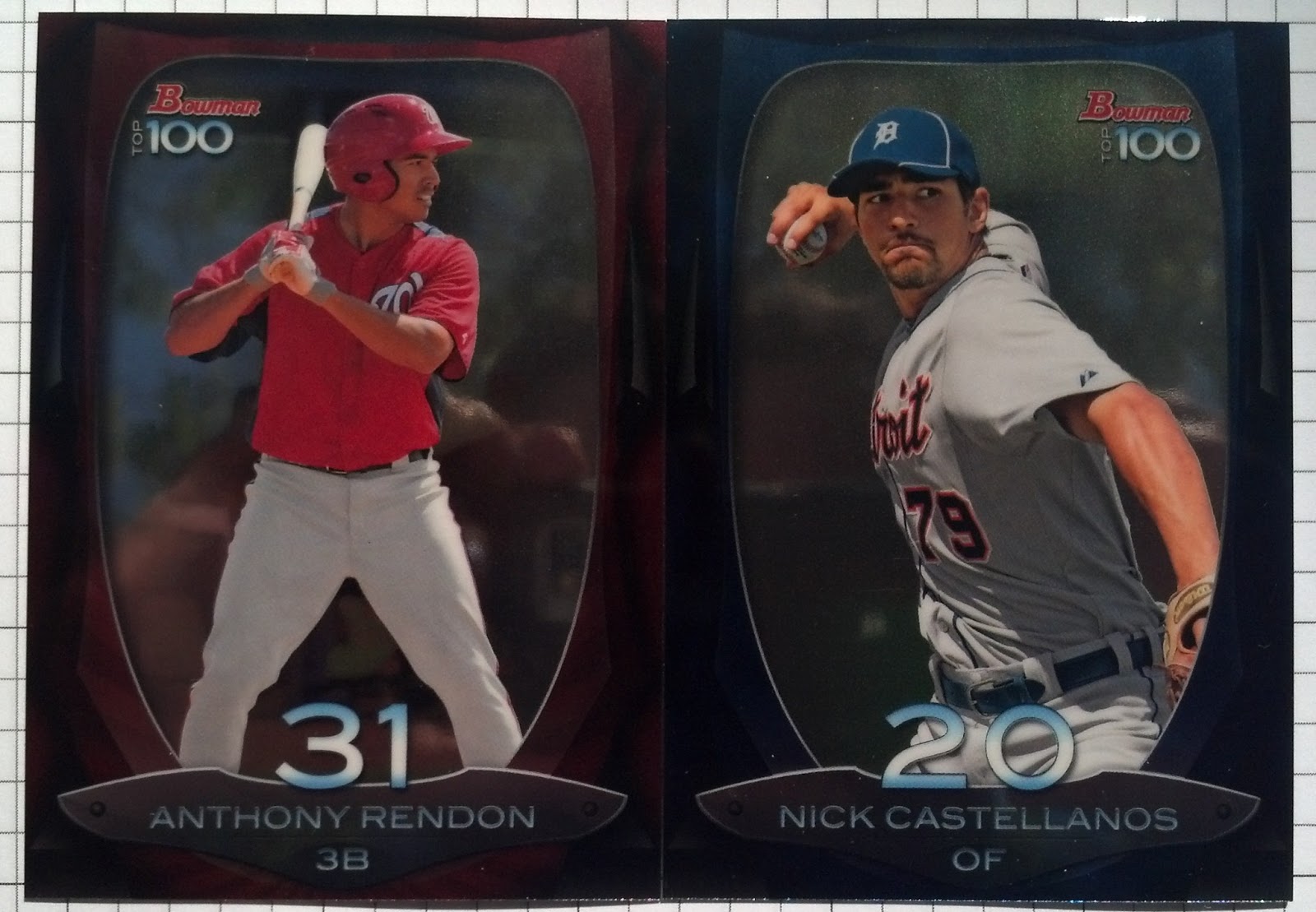
The same with these blokes. There's some heavy hitters in there, including the best DH of all time (THERE, I SAID IT), a first baseman with a helmet and pretty boy Alex S. Gonzalez. These cards are very awesome in-person, so I think in this case the non-scanned images work to my advantage.


This one is a bit of a confession. I really enjoy cards of current Blue Jays in Blue Jays uniforms. It's a simple thing, really. The Rajai is a duplicate, but will fit nicely into my small Raj collection as the first of this one is in my 2013 Topps Rainbow binder. Sergio Santos cards are always welcome. 

But it hasn't been all trades lately, as I have pretty much abandoned ripping packs for buying singles. Fitting into a small player collection of up-and-coming Diamondbacks backstop Stryker Trahan is this beautiful slab:

  
These are very nice, but do not warrant the price tag associated with them. I picked this up for less than $5 I believe - which is an incredibly diminished resale value for this set. I will say, though, that parallels and memorabilia cards from this set are selling for nauseating amounts. 

But let's keep with the Dutch theme.

As you may know, I am a huge proponent of International baseball competition, with nothing falling as dear to me as the World Baseball Classic. And while I generally despise Topps Tribute, holy sweet molasses they blew all other high end sets away with the treasures of 2013 Tribute World Baseball Classic.


Wow. I mean, that is majestic. At least 75% of the patches in WBC Tribute are 2-3 colors, with the solid patches actually in the rare and selling for low dollar amounts.

But it gets better:


This is actually a green, and least necessary, colored parallel from the patch inserts. And it's Jonathan Schoop, who I really, really like. And seriously, look at that patch. Breathtaking. 

Thanks for the cards, Jeroen. Some aces headed your way....eventually.

07 July 2013

Reevaluation.


I thought of a few ways to start this post, but nothing really worked out the way I wanted.

Quotes, rants, whatever.

I believe the best way to convey my recent exhaustion with collecting baseball cards is the above screen grab, taken from an ebay auction earlier this week.

Stunning, and for no damn reason at all.

The JP Arencibia market has been absolutely destroyed by two ebay buyer in a constant pissing contest over his cards. I tracked one of their successes, and said buyer (the one who won the above patch card) has spent over $2000 in JP Arencibia cards in the past two weeks.

Must be nice to have disposable income, eh?

But it's not just JPA cards. 

I recently purchased two boxes of 2013 Pro Debut. I love the base set, but they took the best part about the set and ruined it.

Last year I was all about the patch cards. This year I cannot find more than one which I wish to own.

Oh, and they're all short-printed, repeat logos from 2012 Pro Debut and Heritage Minor Leagues set. They just extended the checklist.

And added mascots. If you want kids in the hobby, Topps, keep the mascots to stickers or Opening Day, not in a $60 box in which one of your "hits" is likely a poorly-printed photo-patch of a mascot from Podunk.

What all of this boils down to is a reevaluation of my place in the hobby. I'll still be around, but not nearly as consistent as before. Last time, I stopped blogging entirely - that won't happen this time. But it makes sense to tone it down a bit. Here's why:

  • The thrill of opening packs was gone with those two boxes of Pro Debut, my one hobby splurge of the year.
  • The JP Arencibia market is dead to me, and my "favourite" player has been kind of a shithead lately, along with playing rather terrible baseball.
  • Financials, of course.
  • I've taken to growing hops and chile peppers, and their maintenance takes up quite a chunk of every day.
  • Storage.  I bought two 3000 or whatever count boxes at my last card show, and they're full, while stacks of other cards have just been piling up.
  • Poor trades. Aside from a few good ones here and there (Jedi Jeff and DHoff, Waiting 'til Next Year), my trades lately have been duds. I've been giving up a lot to get nothing in return more than 1990s and other junk-wax cards. I apologize if that offends anyone, but hey, be respectful of your fellow traders.
I'll still be here, mostly writing negatives, but less so. That's all that's really changing.

Oh, and since I'll probably never win another JPA card, I'm thinking of new, primary player collections:

  • AJ Jimenez
  • Salvador Perez
  • Marcus Stroman
  • Adalberto Mondesi
  • Jonathan Schoop
  • Aaron Sanchez
...and some others.

26 June 2013

Something!

Normally, some bloggers would follow-up a post like mine yesterday with a "...well maybe yesterday I was a bit harsh..." introduction, but I won't be doing that. Aside from the base set and maybe 1-2 inserts per series, 2013 Topps is not special. Series 2 was a major step down in player selection, photography and inserts. 

But, at least there are no pies in the face.

Which I hate.

My JV baseball coach, also one of the most influencial human beings on my life, once said something after we walked-off versus a division rival:

"Act like you've done this before."

You'd think after so long in baseball, the adult men would do this, but they haven't. And so it get shoved in our face in the form of pie-in-the-face, walk-off jump-on-the-plate and horrific celebration cards. No thanks.

At this point I'd like to mention that that little rant there was not planned. But on the bright side, the pie-in-the-face cards have been replace with something much more palatable: 


Autographing! This is the only autograph SP I've really noticed in Series 2, mostly because I just don't care. However, all of your Jose Reyes shall belong to me, soon enough.

On a side, 331 was the final card of Series 1. And the first card of Series 2. More Topps trolling. 

Also, Jose's facial hair on any other human being would be so douchey that I would have guerrilla attack it with a Bic lighter or angry doberman.

While I have my issues with Topps Flagship, I am still going after all of the parallels for certain players. They just look so damn good in pages. My first numbered parallel of Series 2 is a camouflaged Melky Cabrera:


Which leads me to the question -  is this photoshopped? The piping on the pants looks a bit odd, and the scrolling across the chest is a bit too bright, and oh, HIS GLOVES ARE ORANGE.

I would think Melky would have had enough time to find some new batting gloves after his, umm, suspension in 2012. Plus, as the fable goes, he left all of his shit in the Giants locker room once he got slammed...so why would he even have them as a Jay?

One thing I secretly enjoy about this one, however, is this:


Neat. 

Enough Series 2.

Hey! More Joses!


Jose Reyes roooooookies! And a Francisco Lindor purplefractor! These both came to me on Monday night, but at the time, I was hosting an old freind. I enjoy them, but am seriously thinking of un-slabbing one of those clunky cases. Boo.

Of course, I saved the best for last.

That's a thing I often do.

And it's a good one:


Oh yes.

Rymer Liriano is out with Tommy John surgery (I sit back and watch the hits roll in) in 2013, which means his cards can be had quite cheaply. I don't know how many of these I have yet, or how many I need, but I know it's not going to get any easier. Oscar Tavares, Dylan Bundy, Matt Harvey still remain, and they will not come cheap. 

Also, that Lake Elsinore Storm logo is PERFECT for this insert set.

Perfect.

At least it's something.

25 June 2013

nothing.

Nothing.

That's what was going through my mind after opening two blasters of Series 2 this weekend.

Not a damn thing.

Sure, JP Arencibia got some zoomed in love.
The most polarizing of your 2013 Blue Jays.

There were some rookies, and of course, some underloved Blue Jays that never play.
Topps really overdid it on the new Blue Jays BP cap.
Seemed like every Jay in S2 has one on.

But what else was there?

Some parallels.
Well, these two stood out over their barely-replacement-level red counterparts.
Well, it's moderately enjoyable. Anytime where JHey isn't succeeding, I enjoy.

Occasionally quality photographs.
These certainly don't suck, but Topps felt they had to photoshop a Phils uni on Revere, anyway.

More minis, though I love these two second baseman:

Of course, more retired guys on retread inserts:
These guys will have homes.
These will go to their highest bidders. Blow me away.

And two new inserts about as inspiring as an eighth-grade farm boys book report on The Tale of Two Cities:
Some exceptional player selection, I must say, but every damn one looks the same.
The only card out of 160 that made me smile. But how could you not??

And so I felt nothing.

Which is really how things have been going in the card blogosphere lately. Series 2 is a dud. I'll chase my Blue Jays rainbows, but that's it. I might not even attempt to complete it. Even if I do, I'll have to solicit all of you to donate your doubles, because I sure as hell am not buying anymore of this.

Perhaps I was rolling a bit too high after the luck I had with Series 1 (which netted me two Camo parallels and some great blue/red parallels.)

Or perhaps, with a quality, though not-extraordinary effort from Bowman, along with a catshit reiteration of Gypsy Queen, I thought Topps would step it up with a quality product for Series 2. False.

10 June 2013

Ranking the MiLB Logos: Northwest League


As always, logos are taken from the absolutely awesome Chris Creamer's Sports Logos website. Go check it out and love the hell out of the effort he has put into showing quality logos, histories and awesome Disqus comments on this site.


Honorable Mentions - Retired Logos

Before I get into the rankings of the current Northwest League teams, let's take a look back at a couple of teams now defunct.

Southern Oregon Timberjacks

The Southern Oregon Timberjacks (which for the record, is way too long of a name) logo, defunct by 1999, looks more like the logo of a beer league softball team.

And I mean that in the highest sincerity. It's really pretty awesome, and fits the idea you would have of a low-level MiLB team in the Pacific Northwest. IN 2000, the Timberjacks were moved to Vancouver, Washington to become the Vancouver Canadians.

Yakima Bears (Now the Hillsboro Hops)
Due to a weak local economy and repeated failed attempts to build a minor-league quality stadium (yikes), the Bears moved from Yakima, Washington to Hillsboro, Oregon in a move that started as recently as June of last year. The Hops will begin playing in Hillsboro this July when Northwest League play starts up.


The Rankings

8.


Vancouver Canadians (Toronto Blue Jays)

Immediately, we get the favorite-team bias out of the way. I am a Blue Jays fan, and the Canadians (of course) are the Blue Jay's Northwest League affiliate.

Normally, you'd think I'd let them slide a bit out of favoritism and the presence of Roberto Osuna, but the Canadians logo is just...so...boring.

It's two colors, with a secondary shading of one the light red to a dark red. The logo is a "C" with a baseball, terribly uninspired. Additionally, the scroll of the team location and name along the top and bottom of the round logo.

Yawn.

7.

Tri-City Dust Devils (Colorado Rockies)

Can a swirling stack of wind have a soul patch?


Apparently, in Oregon, they do. It's not so much that the 3City Dust Devils logo is bad, it's just not the good. The colors are almost exactly the same as the Omaha Storm Chasers, and yet there is a remarkably similar logo. I believe the Storm Chasers came about much more recently, but they just did a better job of it.

The Dust Devils have a nice text scroll, but the left-right, up-down scroll appended to the awkwardly-shaped logo makes for a strange v-shape blown over in a dust short.

See what I did there?


6.

Spokane Indians (Texas Rangers)

Well, I cannot say much on the Spokane Indians that wasn't present in the Vancouver Canadians logo description. I can, however, detail the very few qualities that make it wholly better, though.

A. Presence of a third color. Surprisingly, the red-white-blue scheme works pretty well here, and if it were just red and blue, or just red and white, I'd puke.

B. The feathers. Understated in the logo, the fact that they are there makes it worlds better than the Canadians logo. 

C. Font variation in the "S". Not unique, but the old-school(ish) text, similar to that of the Boston Red Sox organization and earlier teams, gives the team an old-timey feel. It's actually quite nice.


5.

Eugene Emeralds (San Diego Padres)

The American Pacific Northwest is a unique place, and you'll see more of a theme developing in the coming logos. The Pac-NW has a unique climate and certainly a unique population, and with that comes a lore left over from ancient times and an inspiration for the Eugene Emeralds logo. While the
team isn't called the Bigfoot, Yeti or Sasquatch(i?), the logo shows a well-colored - let's use Sasquatch to fit the colloquium - trouncing around with an evergreen tree - symbolic of the Northwest - to be used as a baseball bat (maybe) or a toothpick (likely). Or as it it depicted in the cap log (left), a meal. Apparently Sasquatches are akin to gin, Imperial Pale Ales and pine tree car air fresheners.

When I first saw this logo, I wasn't thrilled, but it indeed is growing on me - at least the cap logo is.


4.

Boise Hawks (Chicago Cubs)

The Boise Hawks logo is an odd one. The text is overly complex for a baseball scroll, and the use of orange and red in the same logo is rather unheard of. Add green trim on to that (which is much more strongly-stated in the
uniforms, which are ghastly) and the logo gets even stranger. The more I write about it, the less I like it. I do, however, like the hawk on the logo, which is boldly more present on the cap logos (home & away). The Hawks gain points with a killer alternate cap logo, featuring a well-detailed talon of the Hawk grasping a baseball on the alternate red background. This logo could be helped greatly by just removing the orange and going with red and green, similar to that of the Minnesota Wild.

3.


Salem-Keizer Volcanoes (San Francisco Giants)

Taking my geologist background into account, there is a distinct reason I like the Salem-Keizer logo so much.


It's a Volcano, man! Just having a volcano as a mascot lends to an excellent color scheme and unique logo opportunities. While many organizations would likely go very complex with this logo, S-K does not. The logo is simple, a red and black cone with an "S" shaped lava flow (seemingly for Salem) and a wafting plume atop. The text is a bit thin, but it melds well with the logo overall.

Also, the cap logo, uniquely on a gray background, featured a smoking, flaming baseball, seemingly ejecta from the volcanoes in question, inspiring the logo. Baseball? Check. Geology? Check. Pretty colors? More check. This one was hard to top, but alas: 

2. 

Everett Aquasox (Seattle Mariners)

Originally I had the Aquasox ranked lower - fourth, actually. It wasn't until close inspection (and comparison to the older, odder logo) that I bumped it up to a #2 ranking. There are a few too many colors and the detail in the Frog (which resembles a tree frog more than an aquatic one), but the circular logo and unique animal logo make up for that. It is, of course, much cleaner on the cap logo.


The cap logo is what does it for me. The Aquasox are an affiliate of the Seattle Mariners, owners of one of the more unique logos (I'm speaking of the original 70's M-Trident logo, of course) and this has translated all the way down to the short-season Aquasox. Take a look at the cap on the frog's head - it has that M, rotated to make an "E" for Everett. Or for the default scoring of any play involving Jesus Montero.

1. 

Hillsboro Hops (Arizona Diamondbacks)

While I try to avoid bias at all times during these rankings, sometimes they just cannot be ignored. You see, I have recently become a novice hop farmer myself, and am currently being paid by my work (a local Soil & Water Conservation District) to see how we might be able to utilize our ideal environment here in the Wild Onondaga for growing said wonder crop. So yeah, if it means a stable income for me, I am for it!


The Hops are a brand-new team in Hillsboro (Northern Oregon), the result of the dislocation of the Yakima Bears. With the relocation, there came a re-branding, and the folks at Hillsboro nailed it. The logo features the city name and team name (albeit the team name is a bit gaudy, pobody's nerfect), Mount Hood (iconic of the region) an evergreen forest (also very Pacific-Northwest) and a truly awesome, yet smug, hop cone. Of course, the Hop itself is wearing a Hops cap - because why the hell not?

The Hops are yet to play a game - with their relocation less than a year in, and the Northwest League season still a month or so away - and it's a damn shame. I am betting they're going to rock some sweet uniforms, and I cannot wait to get my grubby hop-diggin' paws on a Hillsboro Hops cap.


___

MiLB Logo Aggregate Rankings:

1. Hillsboro Hops
2. Everett Aquasox
3. Tucson Padres
4. Memphis Redbirds
5. Salem-Keizer Volcanoes
6. Oklahoma City RedHawks
7. New Orleans Zephyrs
8. Nashville Sounds
9. Boise Hawks
10. Eugene Emeralds
11. Omaha StormChasers
12. Tulsa Drillers
13. Reno Aces
14. Spokane Indians
15. Round Rock Express
16. Las Vegas 51's
17. Salt Lake Bees
18. Iowa Cubs
19. Albuquerque Isotopes
20. Fresno Grizzlies
21. Sacramento RiverCats +1
22. Colorado Springs SkySox -1
23. Tri-City Dust Devils
24. Vancouver Canadians

Italics = New Additions

08 June 2013

A Want List...With Pictures!

2013 Bowman Want List:

Base:
1, 7, 8, 11, 12, 20, 27, 38, 46, 54, 60, 65, 71, 72, 73, 77, 82, 84, 91, 92, 94, 102, 105, 106, 112, 113, 115, 117, 123, 124, 128, 131, 146, 154, 155, 156, 161, 165, 172, 173, 179, 180, 187, 189, 198, 200, 204, 207, 210, 211, 218.

Prospects:
2, 12, 15, 19, 25, 27,  32, 40, 45, 49, 52, 61, 63, 76, 78, 82, 85, 89, 90, 97, 100, 103, 108.

Top 100:
1-19, 21, 23-30, 32-41, 43-50, 52-77, 79-84, 86-100.

Cream of the Crop Mini Refractors:
A1, A2, A5
AB1, AB3, AB4
AD3, AD4
BO2, BO4, BO5
BRS2, BRS3, BRS4
CC1, CC2, CC3, CC5
CI1, CI2, CI4, CI5
CR1, CR2, CR3, CR5
CRO3, CRO4
CWS3, CWS4, CWS5
DT1, DT3, DT4
HA1, HA3, HA4
KCR1, KCR2, KCR4, KCR5
MB1, MB2, MB3
MM1, MM2, MM3, MM4, MM5
MT2, MT3, MT4, MT5
NYM1, NYM2, NYM3, NYM5
NYY1, NYY2, NYY4
OA2, OA3, OA4, OA5
PP1, PP2, PP3, PP4, PP5
PPI2, PPI3, PPI5
SDP2, SDP3, SDP4, SDP5
SFG1, SFG2, SFG3, SFG4, SFG5
SM1, SM2, SM3, SM4, SM5
STL2, STL3, STL5
TBJ1, TBJ2, TBJ4, TBJ5
TBR1, TBR2, TBR3, TBR4, TBR5
TR1, TR2, TR3, TR4, TR5
WN1, WN2, WN3, WN5


It's been a week since I last posted, which is becoming more the norm than a rarity, here. Being scanner-less, and very much against non-scanned pictures of baseball cards, I do not intend to up my posting rate anytime soon. I am looking at late July/August to grab a new one, possibly using the college-move deals to my advantage.

Anywho.

I've been jumping on a bunch of 2013 Bowman lately.

Here's some new additions from the set:

 Some Domini-CANs, Jairo Beras and some other Yankees guy. I cannot believe how many cards of Yankees prospects made it into this set. Coming from an organization with very, very few MLB-level talented players, it's terribly annoying. It isn't even their good prospects. Org Guys, at best.

I have had quite a streak of pulling in Jairo Beras cards, though. Who on the opposite hand, is actually a decent, high-ceiling prospect in the treeeee-mendous Texas Rangers system. Great time to be a Rangers fan.

Anthony Rendon was a Syracuse Chief for about 3 days before Danny Espinosa went on the DL with a fractured hand (or was it a wrist). It seems we cannot get a reasonable prospect in Syracuse after Strasburg and Harper. Maybe I shouldn't complain, but still. Shitty AAA organization.

I haven't pulled many Castellanos cards, but I dig this one. I like all of the Top 100s, but there is a serious road black in this set that I will get to later.

 Another gold Salvador Perez!

Yes, that's right. Doubles of the monster Royal's backstop. In gold.

This one has a destination picked out already.

At least it's a pretty rad card. Perez blasted a HR versus...somebody last night, and Billy Butler stuck a jar of Billy's Barbecue Sauce into his incredibly large hands to show the camera.

It's for charity.


I've also been doing well with a certain Oriole's second base prospect:

 Schoooooooop!

More Schooooooop!

So I've been doing well with 2013 Bowman. I actually think I might do a Frankeset rather than just collecting base cards. Keep it fresh.


____

But there's a problem with 2013 Bowman.

And that problem, is this guy.

Right now, if I wanted to complete the Bowman set right now, including the Top 100 and Mini Cream of the Crop Refractors of Yasiel Puig, I would spend at minimum, $100. On two cards from this set. 

Two cards.

$100.

No.

So help me out, if you can. 


01 June 2013

Return of the Crotch Logos

Maybe's it's not so much of a return in the "definition" of the word (whatever that means), but Bowman baseball in recent years has made an effort - likely (hopefully) unconsciously - of placing MLB team logos directly on the crotch of unsuspecting big league players.

Perhaps it's censorship, perhaps it's laziness or individuality (no one else seems to be logo-ing up crotches), but the heart of the matter needs some acknowledgement from us, the people who still notice these things, and that will be my intentions with this post.

I swear. Just acknowledgement. No jokes.

Let's start with my boy Jose Reyes.

Based on the look on Jose's face, he's either super-happy to be a Blue Jay and not photoshopped (finally), or a nice Blue Jays logo on the crotch tickles a little bit.

Tickle or not, sometimes you get the dangling Ol' English D:


Hopefully the Venezuelan flag in the background is a bit of a distraction from that BAM right in the groin Tiger logo on Avi here.


I'm kind of speechless on this one. I mean, I am sure the mail-order art degree clan that design Topps cards (Let's take the border and make it 1/10 of an inch wider at the bottom! Genius!) saw this one on the printing logo and thought that it was an instant gem. Yet, the ever-so-softly floating A's logo seemingly descending from, uh, Yoenis' Cespedes, seems kind of fitting to how I feel about the hobby right now.

Unless the logo is ascending...then it's kind of how Topps feels about their customer's these days.

The winner, however, is actually from the chromed-up Top 100 insert set. Behold:


Dylan Bundy's number one.

Eep.

I mean, come on. That has to be intentional.

But seriously, folks. These are just jokes. If you want to go ahead and get offended by the comments I've made on these cards, feel free to not visit this blog ever again.